Thursday, 30 September 2010

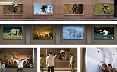
Make a Stand


This interactive ad campaign was developed by Ogilvy and Mather for the World Wildlife Fund to remind the public of the environmental issues in China that are largely overlooked at the expense of money. Passers by could quite literally stand between the hunter and the hunted in a symbolic gesture of defiance. This is a very powerful and well thought out piece of advertising that takes you to the heart of the problem. You get to experience what it's like to stare right down the barrel of a gun, then look back at the beautiful images of wild animals and realise the sheer sadness that the WWF must feel. It makes the situation feel much more real and makes you think that maybe you could actually help to stand in the way of any more animals being unnecessarily killed. This is a hard hitting advertising campaign and a great use of outdoor media.

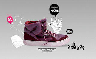
Furry sneakers...mmm

http://satorisan.com/namethatsneaker/


I almost don't want to admit how much time I've spent on this site, but visit it and you'll see why... It takes a little while to load but bare with it, it is worth it.

Simplistic, fun, creative graphic design. What a fantastic site this is.

The website is clean and so easy to use but dull it is not. The bizarre illustrations add personality and a uniqueness to the brand that makes you want to be a part of it. They add that something different, a bit of fun and life to your shopping experience. The sneakers are beautifully shot and sit dominant in the middle of the page so not to be distracted by the graphics. As you flick through the many styles of sneaker you meet more characters and you can even take your favourite shoe on a mad journey through clouds, space, icey mountains and forests, all illustrated with the same fun and care free, black and grey style that is so effective.

Now go, take a look around!

Cycle safe

While browsing for cause related marketing I found this little gem:


In 2007, 21 cyclists in London died because they weren’t seen by drivers. This simple but very effective ad campaign shows how a small-budget of £600,000 reduced deaths on London’s roads by a third. Before moving to Leeds 4 years ago, I had always lived in London and although I love cycling it just was not something I ever felt that safe doing around the centre of London.

I think this ad is great because it doesn't scare cyclists with shocking imagery or all the horrible scenarios that could happen on the roads, discouraging them from riding, nor does it place blame for accidents that have happened. It very simply demonstrates how easy it is to 'look but not see', catching the attention of even those that think themselves very careful drivers.

I feel this campaign is so much more effective than those in the past because it has moved away from the traditional shock tactic strategy and instead tried to actually understand what is causing these accidents. The viewer interacts and plays with the advert making it memorable and something to talk about. So many agencies just want to design the most shocking advert or chilling campaign yet but this idea gets straight to the point without making you never want to leave the comfort of your living room ever again.

Tuesday, 28 September 2010

Big Brother is always watching... 1984


I have just finished reading George Orwell's 1949 novel, Nineteen Eighty-Four. In this book Orwell almost writes as a warning, about his vision of a totalitarian future in which everything and everyone is a slave to a tyrannical government regime. The main character is Winston Smith, a 39-year old man who is an isolated citizen of Oceania. He rebels against The Party and the all seeing, all controlling 'Big Brother'. He forms his own opinions, questions the party and tries to discover the past and the possibilities that could be, if he was free. With great caution, Winston develops a relationship with a woman he works with at the Ministry of Truth, Julia. The sheer exhilarations of this illegal affair leads him and Julia to reject the oppressive lifestyle they've been forced to endure for so long. This however eventually leads to his arrest, tortures and conversion.

This book is so powerful and in some ways terrifyingly relevant to the world we live in today. Orwell demonstrates fantastic foresight and makes bold statements about humanity. This book will send shivers down your spine, it is
unsettling and bleak and will leave you thinking about the future world we are entering.

Not only did I enjoy reading this book, I think the cover design is fantastic. This new striking design was done by
Shepard Fairey, who became famous in 2008 with his HOPE poster for Barack Obama. Combining the iconic eye of 'Big Brother' with barbed wire and the colour red just immediately puts that feeling of being controlled and trapped into you. There have been so many cover designs for this popular book but I think this is definitely one of the most affective and really caught my attention.

Sunday, 26 September 2010

Giles Miller

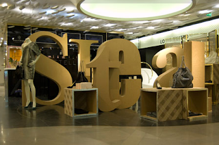
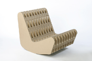
I've always been impressed by the sheer strength and beauty of corrugated cardboard and paper since I went to a furniture design exhibition about a year ago which exhibited seats and stools made out of this wonderful material. I have since discovered the product designer Giles Miller who admits to "falling in love" with the material. Miller both designs new products and creates large scale cardboard instalations for projects, displays and exhibitions. He has worked for Stella McCartney installing her a pop-up shop in Paris and London to display her new fashion designs. The corrugated cardboard creates such a lovely visual and tactile texture which compliments those same qualities in clothes.

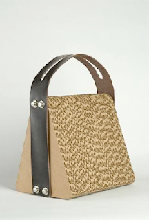
When the strap broke of his laptop shoulder bag he was carrying damaging his computer inside he began experimenting with making a laptop bag from cardboard. After alternating the direction of the corrugation he constructed something that could take the force of the blow. Although I'm not sure I would quite trust cardboard to protect my beautiful Apple Mac I still think this is a beautiful piece of product design which hopefully will inspire other designers to start using materials that can be recycled easily. Its about time we started to exploit unlikely, unappreciated materials, because I suppose you never know what you might create or discover.

Wednesday, 22 September 2010

Nokia's fighting back


Suprisingly I am now also a part of the iphone club. Before being sucked into the world of Apple though I was a huge fan of the Nokia phone. Solid, long-lasting, good old Nokia phones. Also this year I have been working on the Nokia account at Ashley Bolser Agency, creating online marketing campaigns and designing their database emails. Due to this I am still a firm believer in the Nokia brand and how powerful it still is and how much potential it has to fight back at Apple.

The latest adverts for the launch of the Nokia N8 are a step in the right direction for the Nokia brand. Wieden + Kennedy have created a set of films that show various creations made using Nokia technology, including a hamster- wheel- powered phone charger and a short film featuring a 9mm main character shot on the N8 phone. The campaigns strap-line "It's not the technology, it's what you do with it" is empowering for Nokia customers, encouraging them to be creative and help Nokia to get back in the publics good books, having lost a large share of the market to Apple and Blackberry.

These ads are extremely creative and really reflect the fun and quirky side of the Nokia brand. I think they've come up with a great strategy here that fits in well with their brand strap-line "Nokia, connecting people" because this campaign will hopefully bring people together to play with Nokia technology.

Monday, 20 September 2010

Seven days

The adverts for the new reality TV show 'Seven days' starting this week have really got under my skin. They are intriguing, making the program sound interesting without giving much away. The TV adverts are most impactful. The mesmerising and moody sounds of the Xx combined with the surreal combination of lots of different people faces, voices and stories creates something that sends shivers down your spine. The way the ad has been edited so that you never hear the whole of one persons story or see the whole of anyones face lures you in and makes me want to find out more. It is quite literally teasing the audience with tiny snippets of people lives, making you want to watch the program to discover more.

Friday, 17 September 2010

The Original Smooth...

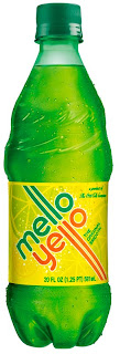
How on earth do Coca Cola do it? Just under a month ago they relaunched their citrus flavored soda drink Mello Yello. Now is anyone else wondering what all hype is about, surely this is just glorified lemonade? Coca Cola, like always have been so clever at marketing and re-branding this product that of course it feels like so much more than just another lemonade...

The website plays the chilled out 1966 song 'Mellow Yellow' to you and shows a short intro video of a cool guy putting on the music and just relaxing with this new soft drink. Although the packaging has a citrus colour scheme the whole brand quite literally feels mellow, uncomplicated and just easy-going. With its retro, 1970s cool new look and rounded, friendly typeface it seems to welcome anyone, there's nothing intimidating or off-putting about it, therefore expanding it's potential market dramatically.

Welcome back Mello Yello

http://www.melloyello.com/

Thursday, 16 September 2010

The One baby Protest

In the run up to the UN summit in New York next week, One, the charity headed by Bono and Bob Geldof, is launching a campaign to ensure that no child will be born with HIV by 2015.

The campaign calls on people to sign up to the petition, to put pressure on world leaders to ensure that no child is born with HIV by 2015.

The campaign encourages users to choose one of five animated babies and a protest message to send on to friends that might also be interested in supporting the cause. Just by taking part in the interaction with the babies on the website you are signing a petition to world leaders!

Obviously some people will seek out petitions like this and sign willingly because they believe in the cause but sadly most people aren't as proactive as this. Therefore One has so cleverly created something that looks like a bit of fun, that people can talk about and send to their friends and almost without realizing are helping to support a very important campaign. It's not that they're fooling people into this, it's just that they're making 'politics' accessible to those that might find it intimidating or all a bit too serious for them. It's not that people don't care, it's just some people aren't interested in listening to balding old men squabbling and might find cute babies and internet interactivity more appealing. Yes the campaign is a little unorthodox and the babies kind of creepy in my eyes but I think it will get peoples attention and that's what they want right?

They are also asking people, including celebrities, to change their profile on their social networking sites to one of them as a baby. This again is a subtle and unimposing way of getting the message to spread.

Check out the campaign website here... http://www.one.org/international/actnow/babyprotest/index.html

Great idea, not sure about the application...

NHS Birmingham East and North just launched a new campaign to warn people of the long-term effects of childhood obesity. The posters show images of children that have been altered to show how they would look with medical conditions and feature captions such as "Ollie Webb, heart attack age 35" and "Asif Khan, stroke victim age 31".

I think the idea is hard-hitting and impactful and will make parents think twice before over-feeding their kids with junk food. I feel however, that although the images were in fact shot by Rankin they let the posters down. To me they seem a little half-hearted and ambiguous and to be honest I think there would have been a number of students who would have been delighted to take on this job for free and produced the same if not better quality of work.

There is one poster however that I feel is really effective, and it's this one below...


Wednesday, 15 September 2010

Does anyone NOT want to be/ be with Audrey Tautou?

Surprising to some I actually like french humor, but over-riding that I LOVE Audrey Tautou and almost every film she's been in. So a couple of weeks ago I wondered down to the Uni library to see if there was a french film I would like to watch, and I found "Priceless". Excitedly I rushed home to watch it, only to discover that there were no subtitles! Ah well, I had nothing else on and I watched it anyway.

To my own astonishment I think I followed the plot pretty well saying that I only have a handful of french holidays and a GCSE under my belt...

The movies deals with the two French favorites (no not baguettes and berets), sex and fashion. Audrey Tautou plays the role of a beautiful gold digger, attaching herself to wealthy men so she can live the high-life through their wallets. She however mistakes a waiter at a hotel bar for being a high roller and the next provider of Chanel dresses and expensive jewellery. He of course doesn't let on that he's just a waiter so he can spend time with this beautiful woman and ends up completely bankrupt. He however, then inadvertently becomes the object of affection for an older widow who soon foots the bills for a fancy hotel room and a new wardrobe. Tautou then begins instructing him in the ways of her world...

No it's not the best movie ever made but I like its Breakfast at Tiffanys' style and the relentlessness of Tautous character. Women are portrayed so often as fluffy and soft, desiring love at first sight and falling for any man with a bit of charm. Tautous' character is far from from the kind and shy women she normally plays and is strong, cheeky and care-free. I really enjoyed watching her take on a more seductive, manipulative character and I think she did it well.

What club shall we go to tonight?

Forget half naked blond bombshells, garish multi-coloured patterns and copy that only fourteen year olds from West London find appealing and check out these promotional flyers for club nights around the world created by Job Wouters (Letman) in collaboration with Roel Wouters. They designed material for clubs like 'Sugarfactory' in Amsterdam and 'Club Rotterdam'. These flyers would definitely sell even the most grimey club to me!

They are uncluttered, bold designs that have room to breath. The hand-made style typography and eye-catching blocks of colour bring an element of youthful creativity without looking naive or innocent.

On the surface these designs are fun and exciting but it's only when you look deeper into the many layers you really start to appreciate the quality of the composition and extraordinary typography skills.


Designer//Slash//Model

While reading the book 'Field Guide: How to be a graphic designer' I came across a case study about Digital Kitchen, a creative agency in the US. I looked them up and found the promo video below...


Yes, it doesn't make me laugh out loud (possibly because of the characters are made so annoyingly frustrating and American) but it is so refreshing to hear an agency talk about themselves and the design they do without sounding horribly pretentious. Through taking a tongue and cheek look at the world of design, Digital Kitchen have produced a promotional short film that doesn't alienate a large percent of the public. So many agencies and designers go on about how the industry is under appreciated and try to glorify the design profession (don't get me wrong I'm glad people are fighting the cause) but this film seems to rise above being resentful and just hilariously pokes fun at the situation.
Through tackling the problem in this way, they have allowed themselves to create a film that not only people in the design industry but anyone can watch, enjoy and still take some important knowledge away with them about a design agency and the design world.

Tuesday, 14 September 2010

Ads are changing tactics

Recently I have noticed a change in direction for a lot of adverts that are directed towards males. Adverts, especially for those products that can be seen as 'fun' seem to have given up on aspirational advertising, including strong, professional business men in their stories but are instead picking up on mens' sense of playfulness, silly quirks and things men really enjoy. They appear to no longer want to persuade men by showing them the great person they could be if they used 'x' product but they are actually embracing males for who they are, warts and all... This allows men to empathise and interact with the advertising, producing a 'that's what I would do' response. For example the new Reno Clio advert doesn't really do a great job of selling the pros of the car itself but it seems to still get the attention of it's male target audience by using humor and including a male character that is realistic and essentially 'normal' and unintimidating. This is a huge step away from the Burton and Cigarette adverts of yesteryear that almost always used formal professional male icons in their advertising but it seems to be working! Other examples of these new types of adverts are the fantastic BT adverts with Adam and Jane and the new Heineken one with the walk in beer fridge!

Monday, 13 September 2010

Design Book Covers


Recently I got my mitts on four Design books published by Antiques Collectors' Club. Like many other of these books their front covers follow the hugely eye-catching black and white pattern combined with a block colour design. The patterns that make up the cover sleeves are inspired by the work of the artist that the book is about, for example the pattern for Nash brothers book is composed of Paul Nash's 1925 engraving, Flower.

The block colours that have been chosen for these four books are so rich and bold that they sit most comfortably among the busy patterns. Sit all the books together and although a little hectic I think they are a real graphic beauty.


Thomas Saraceno at the Baltic


Saraceno's new dramatic installation called 'Galaxies Forming along Filaments, Like Droplets along the Strands of a Spiders Web' really captured my imagination and creativity. He worked with both spider researchers and astrophysicists for several years to develop this impressive 350 cubic metre installation that filled the whole of the Baltics Level 2 gallery.

It's formed from interwoven elastic rope that stretches to the floor, walls and ceiling and instantly provoked thoughts of energy and time and made me remember just how tiny a spec I am within this galaxy. If you wanted to walk around the exhibition you were forced to interact with the installation, climbing over or ducking under its ropes. Bumping into one meant sending vibrations up and around the whole giant web which made it look like a great spider was shivering. The spiky web was somewhat menacing but also beautiful and other-worldly and really got my mind thinking and exploring...


Abram Games- Maximum meaning, minimum means


On my travels I stopped off in Halifax, near to Leeds to go to the Abram Games poster exhibition in Dean Clough Mill. It included over 70 posters, sketches, original works, product designs and films. There were a variety of posters ranging from the ATS recruitment poster that is a WW2 icon to ones for the Festival of Britain and promotions for Guinness, Shell and London Transport.

Games makes words and lettering an inextricable part of the image he is creating, irradicating the need for lines of explanatory text. He combines essentially different objects to create striking new pictorial logic. He so cleverly expresses important issues and messages in such a simple way through the use of just a few objects to create something symbolic. For example, Games combined a spade with a ship in a ploughed field which also looked like a rippling ocean (see image below)...


The point of this poster was to tell people to use spades, not ships and grow their own food. A strong message sent to the public by using just a few simplistic objects. The design is elegant but also extremely impactful and conveys everything you need to know in one concise statement.

'Maximum meaning from minimum means' was Games motto and therefore he would always work out his designs at the size of a postage stamp. The exhibition displayed many of these initial designs and ideas which made me appreciate the amount of work that had gone into each individual poster.


Games argued that all posters looked small from far away so his compositions should be bold and uncluttered. I felt that the poster he designed for Guinness in the 1950s was perhaps the most extreme example of this. It is made up of a simple letter G that also contains a smiley face and a pint. This poster was in fact one of his own favorites...


A poster I found most impactful was one named 'Freedom from Hunger'. It was very shocking but still beautifully crafted and the image still sticks in my head now. The poster combines a sheaf of wheat with a child to make it look like it's emaciated, insinuating that the skinny wheat grains are the child's ribs. He has so ingeniously brought together the problem and the solution in one high-impact symbol.


Beautiful England

For the past couple of weeks I've been traveling around the UK, truly appreciating the beauty we have in this country. Yes it's not always blazing hot sunshine and seductive accents but we really do have some utterly stunning areas of natural beauty and impressive architecture.

Whitby abbey stands strong right at the top of a hill over-looking the seaside town. It is now only ruins because it was destroyed by Henry VIII in 1540 but this only adds to it's romantic charm. The walls are richly carved with 'dog's tooth' embellishment, characteristic of an early English gothic style but also through centuries of wind and rain they also have this spectacular etched and pitted decoration.

These eery but enchanting ruins are renown as the backdrop to Bram Stoker's Dracula, the victorian novel which has made Whitby the 'Goth' capital of Britain.