Friday 3 December 2010
Friday 29 October 2010
Rationale
The main aim of this blog was to research the creative design world thoroughly and highlight and analyse key areas that interest and inspire me. I wanted to begin by searching through a wide variety of different kinds of design work until I found an area that really appealed to me that I could start focusing my research on.
I started off my blog by looking into quite a bit of illustrative work, inspired by the sheer variety of styles there are. The use of illustration in design can really add that element of fun or humor to the work. For example, the typography book Hyperactivitypography from A to Z was created for people who obviously are enthusiastic about typography and therefore most probably design too. This provided a creative opportunity for the designers of the book to use this appreciation and beautifully illustrate the book with soft block colours in a fun and youthful style. This gave the reader a sense of nostalgia, remembering their classroom days of working through booklets that tested their knowledge just like this one. I feel this really shows the power of illustration and just how much it can really change your experience of or feelings towards a piece of design.
The Satirical Comic Book exhibition I went to at the Tate Modern also demonstrates this. Through the use of comic illustrations artists could represent a serious person or event in a humorous way. You can make something funny through using words but it’s not as instant or universal as creating an image. The artists grabbed hold of the greed and self-delusion that characterised their modern consumer society and developed exaggerated and ridiculous illustrations to create highly entertaining pieces of satirical art.
The media in which designers chose to create their work from is both strategic and important because as I’ve found out from these two pieces of design it adds so much to the work and can really change the way people perceive it.
Illustration used within the design of a website is also very effective when you want to make the site interactive. I found a couple of websites that used illustration to dramatically improve the users experience. The Satorisan Sneakers site used bizarre illustrations of creatures to add personality and uniqueness to each shoe presented on the website. Without this graphic element the brand relies solely on the shoe to sell itself. However through creating these interesting and entertaining creatures it both keeps people on the site for longer because they enjoy the experience they’re having but also it creates an appealing image for the brand and therefore the shoes they’re selling, that customers will buy into. The websites I found were very interactive and gave the customer the opportunity to almost enter the world of the brand and explore. This made a huge difference to the amount of time I spent on the sites and how much I both enjoyed and remembered them.
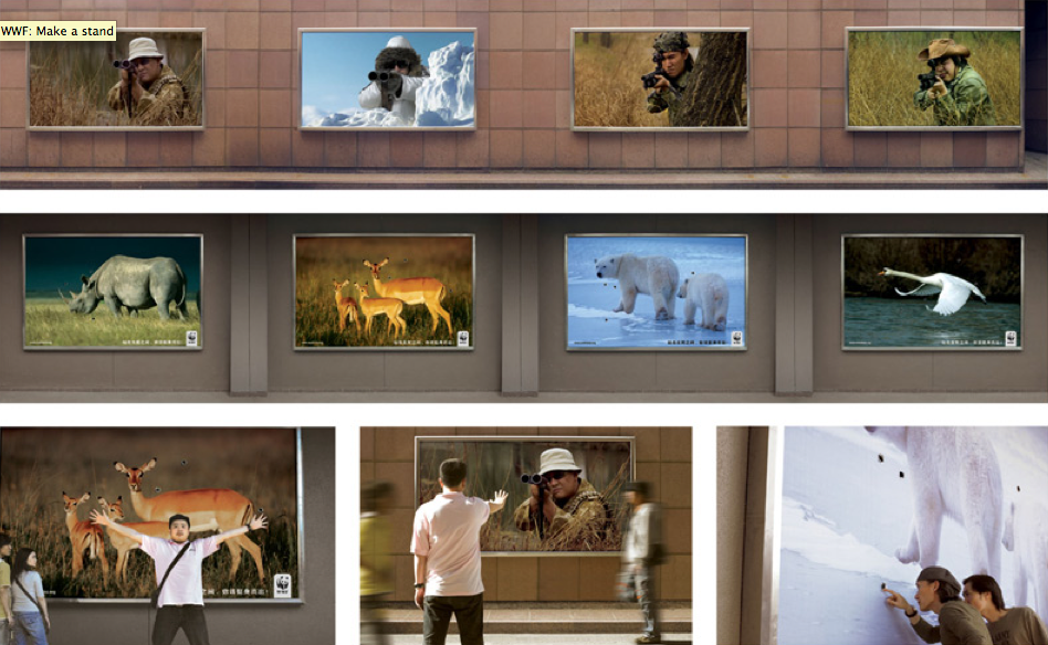
This got me thinking about how this element of design could be used for other media. The campaign for the World Wildlife fund I felt did this very well. They strategically placed large images of endangered and over-hunted animals down one side of a street and images of the actual hunters with guns facing them on the other side. Passers by could quite literally stand between the hunter and the hunted in a symbolic gesture of defiance. Through allowing the public to interact like this creates a ‘buzz’ around the campaign and people will remember it. It also makes the problem seem more real when you’re given the opportunity to stand, like the animals in front of a gun. Therefore getting the public involved increased the impact and success of this campaign.
The Test Your Awareness campaign also demonstrates the power of getting people to interact with cause campaigns. Through asking people to test their own awareness it gets them to focus and pay attention, hoping to outsmart the campaign. I can’t speak for everyone else but I most definitely did not outsmart anyone and because of that it made me realise that even if you’re looking, you do not always ‘see’. Designing the campaign in this way makes people empathise with the issue because after taking part in this test they understand it. This is an extremely clever campaign that proves that how you get the public to understand and empathise with your cause is very important and something to think about creatively.
I started to become more and more interested in campaigns designed for specific causes because research and strategy are very important, it’s not just about making something look nice you’ve really got to make people actually feel and do something.
The Abram Games exhibition I visited in Halifax was especially inspiring. Although his work is dated and does not involve any technology or new marketing techniques he still grabs you with his simple but highly powerful and symbolic posters. His Freedom for Hunger poster combines a young boy with a sheaf of wheat. By bringing the problem and solution together in one symbolic image, Games gets an important message across instantly. The Syphilis Sucks campaign also uses this same notion of bringing the problem and solution together to create a simple yet impactful piece of design.
I think the most powerful campaign I researched is “Woman are Heroes”, designed by the Parisian artist JR. This campaign combines different media in many different countries around the world to try and reach as many people as possible. He both attempts to raise awareness in the countries in which the issues are occurring but also in the Western world because he knows that if they empathise about this cause they will want to help too and will have more resources and facilities to do so. The innovative and creative application of the photographs taken increases the impact of the campaign. It makes people talk about it and putting the photos on trains and buildings within cities means that they cannot be missed. JR has created a very beautiful but powerful campaign that is still on going today. He brings the issue right down into peoples every-day lives where they cannot ignore it.
The aim of every cause campaign is to raise awareness and to get people to do something that will help their cause. The first and most important thing though is to actually reach the public, to be seen, to be heard and to be listened to. The public needs to empathise with your campaign to want to help it and from researching I have discovered that there are so many different ways of getting people to understand and care about your cause. I think I want to research deeper into how cause campaigns really target their audience, get their voice heard and what makes them successful so I can start to develop my own and try and make a difference where I can.
Monday 25 October 2010
Devil Yogurt


Sunday 24 October 2010
Bras for a Cause


Peace, love & Juicy Couture


Saturday 23 October 2010
Social media and small cause campaigns

Mothers Day 2010 brought about a small but impressive campaign called To Mama with Love created by Epic Change and a host of great volunteers. The aim of this campaign was to raise money to support Mama Lucy in her efforts to educate children in Tanzania.
Mama Lucy saved her own income to start a primary school in Tanzania, believing that education is the key to transforming a country gripped by poverty. Over the last six years, Mama Lucy has grown the school from one classroom with fewer than 10 students, to a school that now serves more than 300 children at eight grade levels.
The initiative was simple but powerful. Supporters were encouraged to honor their own mothers by making a donation and then creating a virtual scrapbook or “heartspace” on the site, including photos, videos, notes, and artwork. They could then share their “heartspace” with their mother, friends and family via Twitter and Facebook, or via a customized e-card.
Using social media as the primary communication and engagement mechanism, Epic Change was able to raise close to $17,000 and provide a safe home for 17 children in Tanzania, while also encouraging more than 300 mothers along the way. They did all of this in about a week’s time.
This shows just how powerful social media can be for non-profit organisations, both large and small. It allows you to reach out to a huge amount of people and give them the opportunity to help make a change through a media that's very much a part of their everyday life.
Thursday 21 October 2010
The wonderful world of Erica il cane


Women are heros
TRAILER " WOMEN ARE HEROES"
Uploaded by JR. - Discover more animation and arts videos.


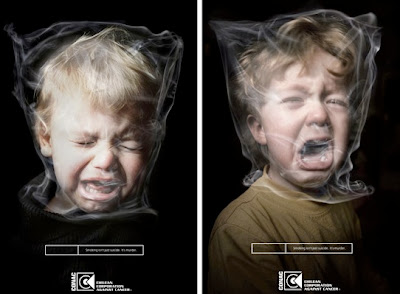
Anti-smoking
Wednesday 13 October 2010
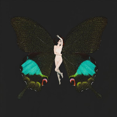
Psyche


Monday 11 October 2010
Go Leeds!

The Lanuvium Marbles are back ready for display in Leeds City Museum again.
The group of statues includes four torsos of cavalrymen and the heads of two horses discovered in Lanuvium. They were originally brought to Leeds by Sir John Savile Lumley in 1896. He was British ambassador to Rome at the time.
The life-size statues carved from solid marble have recently been on loan for six months to an exhibition at the Musei Capitolini in Rome. The sculptures imitate the Greek bronzes of Alexander the Great and his bodyguards. The group would reinforce the idea of Lucullus being a mighty warrior.
Public sculpture informed the population about Roman victories and were used to reinforce the might of Rome in an age before radio and TV. Sculpture to the Romans was therefore their very own marketing tool, used effectively to promote and communicate. This is a surreal but interesting thought, combining modern ideas with old fashioned applications...
Sunday 10 October 2010
Hello mexx..


 I'm not much of an internet clothes shopper but I just fell across this Mexx campaign site and I thought it was wonderful. The full screen photography combined with bright lighting that seems to twinkle off the cool blue background is just beautiful. They've created this dreamy, wintery world that makes you want to snuggle up in front of the fire in that new wooly Mexx jumper. The photography is aspirational but not in an intimidating, high fashion way. The models, especially the children are so natural and have their own unique look. The music also adds to the other worldliness of this site. It starts a little eery, made up of strings a steady but soft beat and sounds that in my head are a little like water droplets.
 My dream home...


Syphilis Sucks!


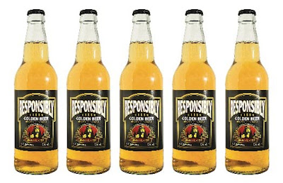
Drink "Responsibly"

A promotional beer developed for the band MundoJazz has given itself the genius name “Responsibly”. It’s a neat bit of thinking because obviously if every alcohol brand in the UK is meant to tell us to “please drink responsibly” in their advertising, then everyone is advertising this cunning beer brand for them!
The name instantly provides a cheeky and bold personality for the brand, which makes the beer’s own advertising virtually write itself. Check out the fantastic “may cause..” copy at the base of the posters, it's funny and thoroughly supports the cheeky personality. I love how this brand has thrown political correctness straight out the window and replaced it with sheer creativity and fun.
Thursday 30 September 2010
Make a Stand

Furry sneakers...mmm

Cycle safe
I think this ad is great because it doesn't scare cyclists with shocking imagery or all the horrible scenarios that could happen on the roads, discouraging them from riding, nor does it place blame for accidents that have happened. It very simply demonstrates how easy it is to 'look but not see', catching the attention of even those that think themselves very careful drivers.
I feel this campaign is so much more effective than those in the past because it has moved away from the traditional shock tactic strategy and instead tried to actually understand what is causing these accidents. The viewer interacts and plays with the advert making it memorable and something to talk about. So many agencies just want to design the most shocking advert or chilling campaign yet but this idea gets straight to the point without making you never want to leave the comfort of your living room ever again.
Tuesday 28 September 2010
Big Brother is always watching... 1984

Sunday 26 September 2010
Giles Miller

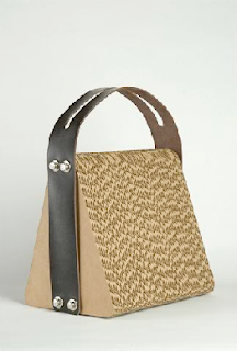
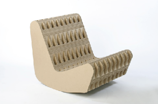
When the strap broke of his laptop shoulder bag he was carrying damaging his computer inside he began experimenting with making a laptop bag from cardboard. After alternating the direction of the corrugation he constructed something that could take the force of the blow. Although I'm not sure I would quite trust cardboard to protect my beautiful Apple Mac I still think this is a beautiful piece of product design which hopefully will inspire other designers to start using materials that can be recycled easily. Its about time we started to exploit unlikely, unappreciated materials, because I suppose you never know what you might create or discover.

Wednesday 22 September 2010
Nokia's fighting back
Monday 20 September 2010
Seven days
Friday 17 September 2010
The Original Smooth...