Thursday, 30 September 2010

Make a Stand


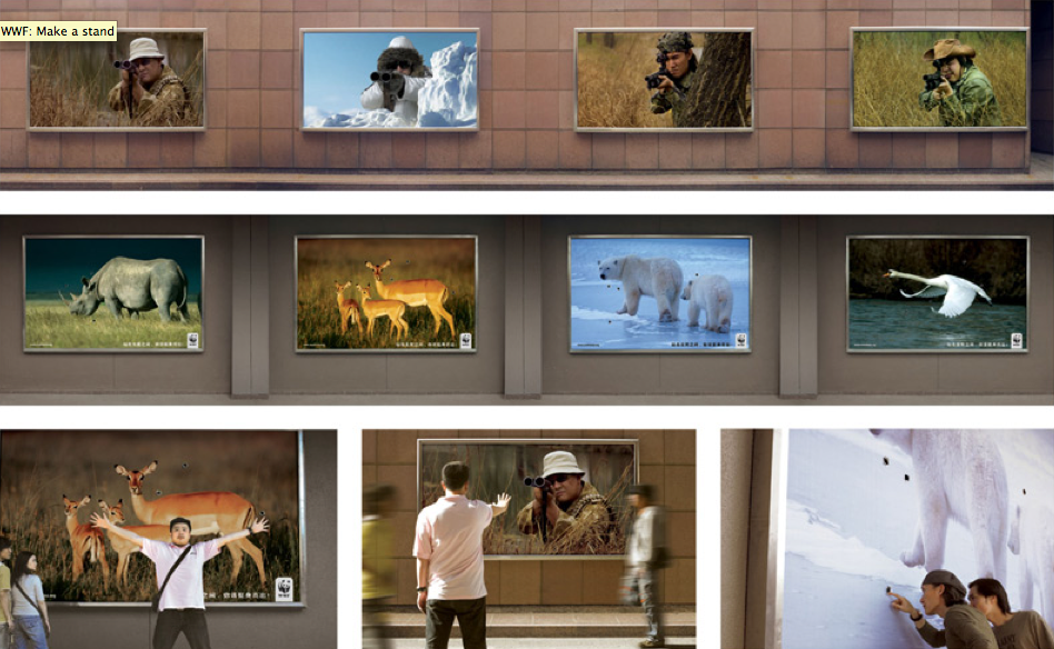
This interactive ad campaign was developed by Ogilvy and Mather for the World Wildlife Fund to remind the public of the environmental issues in China that are largely overlooked at the expense of money. Passers by could quite literally stand between the hunter and the hunted in a symbolic gesture of defiance. This is a very powerful and well thought out piece of advertising that takes you to the heart of the problem. You get to experience what it's like to stare right down the barrel of a gun, then look back at the beautiful images of wild animals and realise the sheer sadness that the WWF must feel. It makes the situation feel much more real and makes you think that maybe you could actually help to stand in the way of any more animals being unnecessarily killed. This is a hard hitting advertising campaign and a great use of outdoor media.

Furry sneakers...mmm

http://satorisan.com/namethatsneaker/


I almost don't want to admit how much time I've spent on this site, but visit it and you'll see why... It takes a little while to load but bare with it, it is worth it.

Simplistic, fun, creative graphic design. What a fantastic site this is.

The website is clean and so easy to use but dull it is not. The bizarre illustrations add personality and a uniqueness to the brand that makes you want to be a part of it. They add that something different, a bit of fun and life to your shopping experience. The sneakers are beautifully shot and sit dominant in the middle of the page so not to be distracted by the graphics. As you flick through the many styles of sneaker you meet more characters and you can even take your favourite shoe on a mad journey through clouds, space, icey mountains and forests, all illustrated with the same fun and care free, black and grey style that is so effective.

Now go, take a look around!

Cycle safe

While browsing for cause related marketing I found this little gem:


In 2007, 21 cyclists in London died because they weren’t seen by drivers. This simple but very effective ad campaign shows how a small-budget of £600,000 reduced deaths on London’s roads by a third. Before moving to Leeds 4 years ago, I had always lived in London and although I love cycling it just was not something I ever felt that safe doing around the centre of London.

I think this ad is great because it doesn't scare cyclists with shocking imagery or all the horrible scenarios that could happen on the roads, discouraging them from riding, nor does it place blame for accidents that have happened. It very simply demonstrates how easy it is to 'look but not see', catching the attention of even those that think themselves very careful drivers.

I feel this campaign is so much more effective than those in the past because it has moved away from the traditional shock tactic strategy and instead tried to actually understand what is causing these accidents. The viewer interacts and plays with the advert making it memorable and something to talk about. So many agencies just want to design the most shocking advert or chilling campaign yet but this idea gets straight to the point without making you never want to leave the comfort of your living room ever again.


Tuesday, 28 September 2010

Big Brother is always watching... 1984


I have just finished reading George Orwell's 1949 novel, Nineteen Eighty-Four. In this book Orwell almost writes as a warning, about his vision of a totalitarian future in which everything and everyone is a slave to a tyrannical government regime. The main character is Winston Smith, a 39-year old man who is an isolated citizen of Oceania. He rebels against The Party and the all seeing, all controlling 'Big Brother'. He forms his own opinions, questions the party and tries to discover the past and the possibilities that could be, if he was free. With great caution, Winston develops a relationship with a woman he works with at the Ministry of Truth, Julia. The sheer exhilarations of this illegal affair leads him and Julia to reject the oppressive lifestyle they've been forced to endure for so long. This however eventually leads to his arrest, tortures and conversion.

This book is so powerful and in some ways terrifyingly relevant to the world we live in today. Orwell demonstrates fantastic foresight and makes bold statements about humanity. This book will send shivers down your spine, it is
unsettling and bleak and will leave you thinking about the future world we are entering.

Not only did I enjoy reading this book, I think the cover design is fantastic. This new striking design was done by
Shepard Fairey, who became famous in 2008 with his HOPE poster for Barack Obama. Combining the iconic eye of 'Big Brother' with barbed wire and the colour red just immediately puts that feeling of being controlled and trapped into you. There have been so many cover designs for this popular book but I think this is definitely one of the most affective and really caught my attention.

Sunday, 26 September 2010

Giles Miller

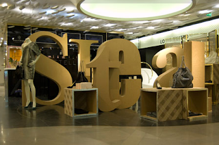
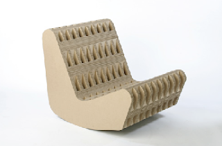
I've always been impressed by the sheer strength and beauty of corrugated cardboard and paper since I went to a furniture design exhibition about a year ago which exhibited seats and stools made out of this wonderful material. I have since discovered the product designer Giles Miller who admits to "falling in love" with the material. Miller both designs new products and creates large scale cardboard instalations for projects, displays and exhibitions. He has worked for Stella McCartney installing her a pop-up shop in Paris and London to display her new fashion designs. The corrugated cardboard creates such a lovely visual and tactile texture which compliments those same qualities in clothes.

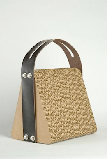
When the strap broke of his laptop shoulder bag he was carrying damaging his computer inside he began experimenting with making a laptop bag from cardboard. After alternating the direction of the corrugation he constructed something that could take the force of the blow. Although I'm not sure I would quite trust cardboard to protect my beautiful Apple Mac I still think this is a beautiful piece of product design which hopefully will inspire other designers to start using materials that can be recycled easily. Its about time we started to exploit unlikely, unappreciated materials, because I suppose you never know what you might create or discover.


Wednesday, 22 September 2010

Nokia's fighting back


Suprisingly I am now also a part of the iphone club. Before being sucked into the world of Apple though I was a huge fan of the Nokia phone. Solid, long-lasting, good old Nokia phones. Also this year I have been working on the Nokia account at Ashley Bolser Agency, creating online marketing campaigns and designing their database emails. Due to this I am still a firm believer in the Nokia brand and how powerful it still is and how much potential it has to fight back at Apple.

The latest adverts for the launch of the Nokia N8 are a step in the right direction for the Nokia brand. Wieden + Kennedy have created a set of films that show various creations made using Nokia technology, including a hamster- wheel- powered phone charger and a short film featuring a 9mm main character shot on the N8 phone. The campaigns strap-line "It's not the technology, it's what you do with it" is empowering for Nokia customers, encouraging them to be creative and help Nokia to get back in the publics good books, having lost a large share of the market to Apple and Blackberry.

These ads are extremely creative and really reflect the fun and quirky side of the Nokia brand. I think they've come up with a great strategy here that fits in well with their brand strap-line "Nokia, connecting people" because this campaign will hopefully bring people together to play with Nokia technology.

Monday, 20 September 2010

Seven days

The adverts for the new reality TV show 'Seven days' starting this week have really got under my skin. They are intriguing, making the program sound interesting without giving much away. The TV adverts are most impactful. The mesmerising and moody sounds of the Xx combined with the surreal combination of lots of different people faces, voices and stories creates something that sends shivers down your spine. The way the ad has been edited so that you never hear the whole of one persons story or see the whole of anyones face lures you in and makes me want to find out more. It is quite literally teasing the audience with tiny snippets of people lives, making you want to watch the program to discover more.