Wednesday 18 August 2010

Floating type...


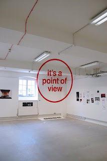
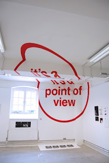
As part of their final project, design graduates Joseph Egan and Hunter Thompson created anamorphic typography installations that appear to float in mid air. The large slogans that are only legible from certain angles are meant to explore the relationship between architecture and graphic design.

Egan and Thompson's work makes you challenge the conventional view that graphic design is largely a 2d oriented art from. At first glance these photos look like photoshopped images and not something you can actually step into. Although the photos are obviously very impressive I can't help but feel that we're missing out on the true impact of these fantastic graphic installations by not experiencing them for real.

Check out the video below, it is truly astounding. It proves to the world that Graphics in the 21st Century has no boundaries and is more than just nice images printed on nice stock.

http://www.youtube.com/watch?v=oCSCG-1ywJA&feature=player_embedded
Monday 9 August 2010

Salts Mill


This weekend I took a trip over to see the extremely impressive Salts Mill in Saltaire. As you walk up to the gigantic building built in the 1800s you almost feel like a tiny Mill worker from days gone by. It's so imposing and stands so strong after all this time you can't help but be impressed.
I instantly regressed back to my excited youth, drooling over the hundreds of art and design books surrounded by the beautiful old brick walls and 19th century architecture. The book that really stole the show for me however was this small book of postcards by Charley Harper. His illustrations create order out of the chaotic natural world. I enjoy the way the animals are broken down in to their most simple forms; shapes and patterns. All the pictures are perfectly balanced through the use of precise shapes and geometric principles. He wonderfully combines patterns, colours, lines, shapes and textures to create such interesting and unique images.

Tuesday 3 August 2010

The best yet Pixar!


Now I didn't think Pixars' short films got much better than Knick Knack (you know the one with the snowman stuck in a snowglobe) but their latest short animation is by far the most creative and is just so sweet.

When Day encounters Night sparks fly but when suspicions turn to curiosity they realise that their new friendship can offer a new perspective on the world. Yes it's a nice little story that makes you feel all warm and fuzzy inside, like you just want to hug the person next to you but this is not what makes this animation so great. The contrast of the colours and moods within the Day and Night characters make the film so dynamic. The characters interact and move together seemlessly even though within their bodies they reveal two very different times. The character design is simple so to keep the attention on what's inside the silhouette of their bodies and not on just what they look like. The use of sound is also incredible! The characters never say anything with their mouths but the noises of the scenes going on inside their bodies reflect their movements and emotions.

This might all sound a bit random and confusing but believe me, this animation is quite a hard one to explain so just watch it! Go go go. http://www.youtube.com/watch?v=zDAnUF5i6Uc